This piece is an ode to something I love: digital products. Specifically, delightful ones.
It's a sunny Saturday in October, 32°C and typical Accra weather. I should be in a pool downtown. Instead, I'm daydreaming about a trip out of town, maybe a staycation. I pick up my phone and swipe through a sea of apps, looking for a pop of coral with a sliver of white. You guessed it: Airbnb.
I've been a user for 11 years. That's long enough to stay married to someone and give an honest verdict on their character. Allow me to do the same for Airbnb.
The core offering sold me. But the why behind the product, and how it makes me feel, sealed the deal. I can tell when creators genuinely care about their users, because the product evokes a specific emotion. Airbnb does this consistently.
One feature stands out. Hours after I abandon a search, I get a notification that reads something like: "We kept searching for listings in [location] while you were away."
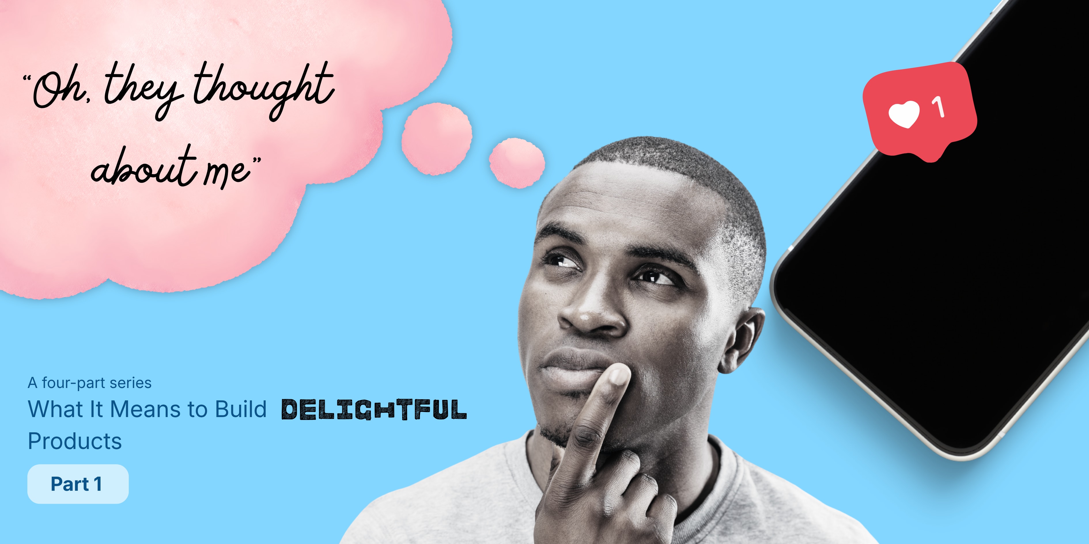
That's it. That's the feeling. Oh, they thought about me.
Airbnb didn't wait for me to come back and start over. It anticipated what I wanted and quietly did the work in the background. That one notification captures almost everything this series is about.
Defining "delightful"
"Delightful" is a broad term and easy to misread, so let's pin it down for this series:
A delightful product eliminates cognitive load, anticipates user intent, and executes its core loop with exceptional craftsmanship.
In plain terms: I shouldn't have to spend mental energy figuring out how your app works. It should see my needs coming and act on them, and it should do all of this gracefully. When a product pulls that off, it has reached a level of excellence most never do.
Many pulleys and gears work together to create that feeling. This four-part series breaks them down:
- Velocity and Invisible Mechanics
- Tactile Polish and Spatial Coherence
- Empathy at the Edge Cases
- Earned Personality
Let's start with the first.
Part 1: Velocity and Invisible Mechanics
Our expectations of speed keep moving. Research on human-computer interaction has long shown that around 100 milliseconds feels instant, while about one second is enough to break a user's flow of thought. Anything longer and we start wondering if something is broken.
Delightful products respect those thresholds. They do it through raw speed, but also through visual cues, clever defaults and work that happens quietly behind the scenes. Perceived responsiveness matters as much as actual performance.
Optimistic UI updates
When you like a post on X or send an iMessage, the result should appear on screen instantly, before the server confirms it. That immediate feedback makes the app feel fluid.
If the network fails, the system should reconcile gracefully: retry in the background, queue the action, or flag it clearly. Never leave the user staring at a spinner. Nobody likes a slow app, and slowness makes users irritated fast.
Aggressive defaulting
A one-time PIN is only four to six digits. But switching apps to fetch it during onboarding feels like an eternity.
The better experience is to surface the OTP right above the keyboard and autofill the field. One tap, done.
Great apps eliminate blank-state paralysis. Sensible defaults, auto-detected input types and smart sorting turn keystrokes into taps. Show a numeric keypad for phone numbers, an email keyboard for email fields. Small touches like these add up to an app that feels like it's working with you.
Invisible mechanics
The best speed is the kind you never notice. Delightful apps do work before you ask:
- Prefetching the screen you're most likely to open next
- Skeleton screens instead of spinners, so the layout appears before the content
- Auto-saved drafts. Close WhatsApp mid-message and your unsent text is still there when you return.
- Remembering where you left off, whether that's a search, a cart or a half-filled form
Airbnb's "we kept searching" notification belongs here too: a background process, surfaced at exactly the right moment.
Low time-to-value (TTV)
Time-to-value is the gap between opening an app and getting the thing you came for: the core dopamine hit, the job-to-be-done. In great products, it's measured in seconds.
I've abandoned countless apps because getting started felt like a tooth extraction. Maybe that's an exaggeration, but you get the idea.
The fix is to defer everything non-essential until after the user has experienced value. Duolingo lets you finish a lesson before it asks you to create an account. Airbnb lets you browse listings without signing in. By the time they ask for your details, you already want to stay.
Guide users to their first win, then invite them to finish setup once they're invested. This improves retention and cuts churn.
Speed is felt, not just measured
Nobody enjoys a sluggish app that takes forever for even the simplest interaction. The best products feel fast, even when they aren't technically the fastest. They get there by removing unnecessary steps, anticipating outcomes, and quietly doing the work before you ask.
That's the kind of speed that makes a user pause and think: Oh, they thought about me.
See you in Part 2, where we'll explore Tactile Polish and Spatial Coherence.